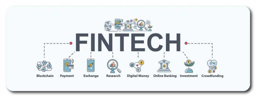
To start this challenge, we had to know what we were talking about, in which world we were going to face, so we started by creating some research objectives. The first thing we had to understand was what fintech was and what was its current positioning within banking, as well as understanding such as it interacted with traditional banking as well as its similarities and differences. In which we found that there is a great diversity of Fintechs, which specialize in different sectors of banking and the economy, as well as PFMs can not completely cover the needs of users, so traditional banking is still necessary.
The use of PFMs in everyday life improves convenience and streamlines certain routine processes and in recent years we can see a great growth of cryptocurrencies and investment in them.
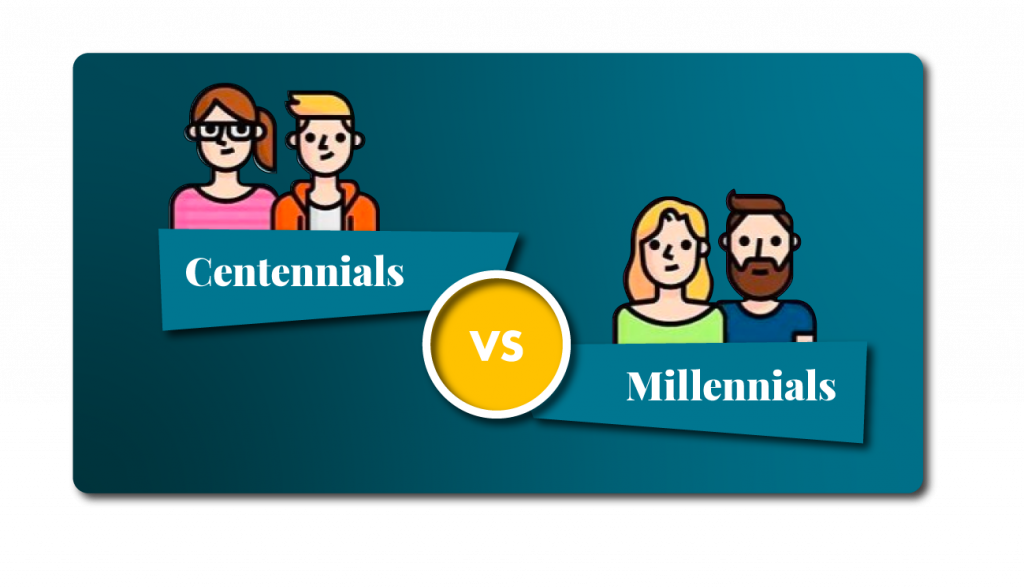
Once we understood the Fintech ecosystem and specifically the PFMs, we started to investigate the “ Millennial and Centennial generations. From this process we obtained a series of guidelines and biases that would give us the keys to adapt the interviews and surveys to our target users.
Common traits between both generations:
- Accustomed to globalization.
- Digital construction of identity.
- They live with disbelief of everything institutional.
- They assume the “economy of uncertainty”.
Demands to banking services:
- Accustomed to globalization.
- They value the digitalization of banking services.
- They take into account the offer of additional products that streamline and facilitate their daily lives.
- They demand offers, grants and financial aid due to the general precariousness of their economy.
- They demand immediacy in banking processes.
What’s on the market
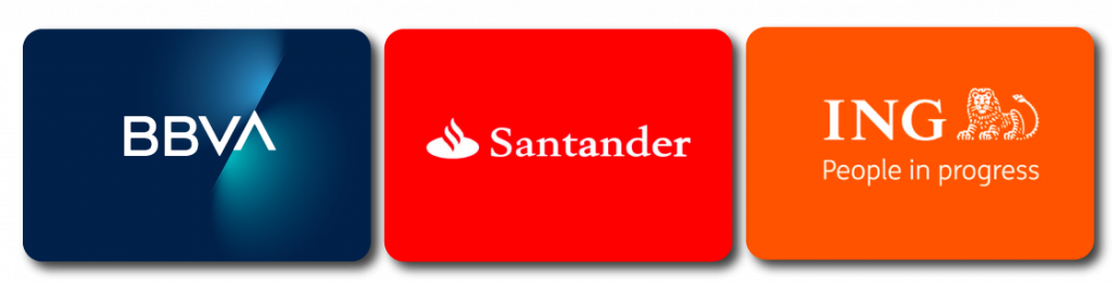
We conducted a benchmarking, analyzing the different existing PFMs, both those of traditional banking, such as BBVA, Santander or Ing; as well as PFMs that are not linked to any bank such as Fintonic, Goin and Arbor, among others.
From this analysis we have been able to conclude that:
- Apps from large banks have more resources and therefore, their digital platforms are more complete and versatile.
- External PFMs have more specific services to cover certain needs such as savings.
- The security of personal data in this area is a top priority.
- Visual support to reinforce the verbal message is important, especially in technical areas.
- Platforms with an initial walkthrough help users to familiarize themselves with the platform, avoiding possible usage errors in the future and ensuring a better user experience.
With these conclusions, it was time to get to know the user and contrast the information obtained in the desk research with what our users, millennials and centennials, think.
First we conducted a survey of 90 people, where we were able to classify our users by age and see, according to their generation, what relationship they have with digital banking and PFMs, starting by knowing if they are familiar with the terminology. We were also able to see, broadly speaking, which banking entities are the most used by these generations in Spain and what is the main use they give to the platforms, among other things.
At the same time, we conducted a 21-question interview with 10 users in order to find out what they think of traditional banking, online banking and PFMs.
From this we were able to conclude several things:
- The activities most performed in PFMs are related to savings, transfers and personal finance.
- 50% of respondents only use their bank’s app.
- 63% of respondents have more than one account in different banks.
- 87% of the respondents have their accounts in big banks.
- 92% of respondents use their banking app a couple of times a week or more.
- New generations prefer to do their banking digitally.
- They demand tools that control their spending and help them save.
- They consider the understanding of the financial terms used to be complex.
- They demand agile and immediate communication systems with the platforms.
- They have a very negative perception of traditional banking.
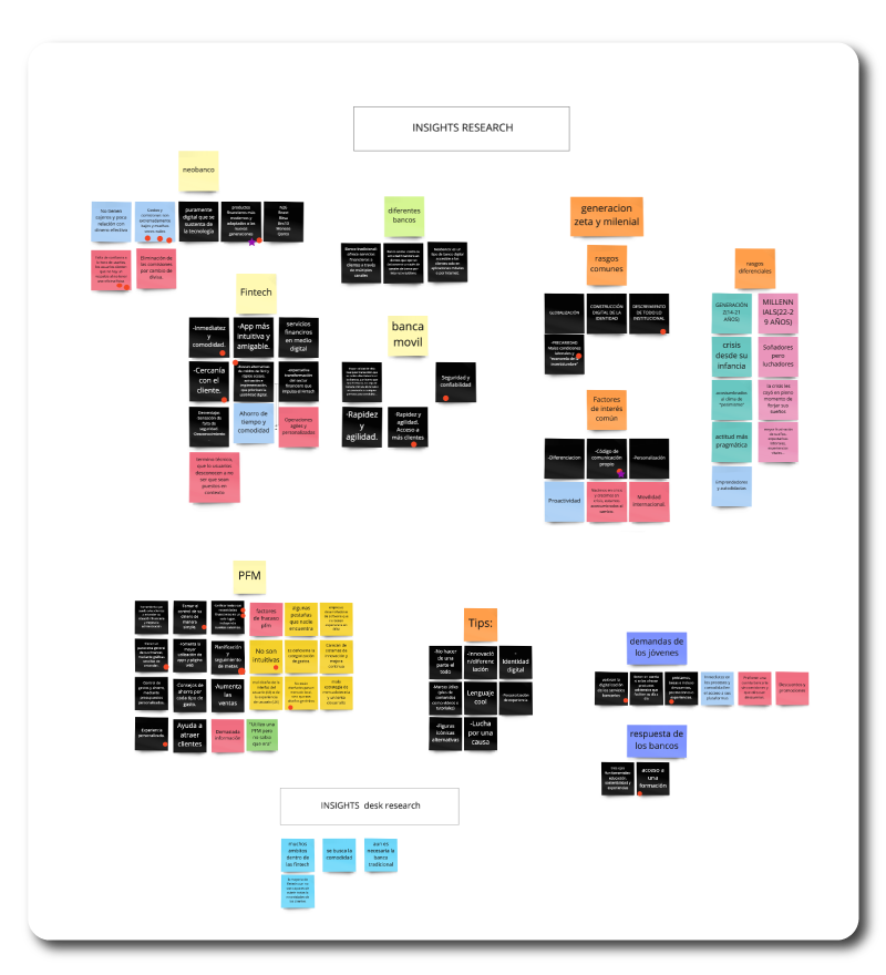
With all this, we created our affinity map, with which we were able to obtain an overall view of the research, from which, by voting on the points that each team member considered most important, we arrived at our Insights:
- There is a loss of confidence in traditional banking.
- There is a demand to update and adapt financial products to target users.
- There is a communication difficulty caused by the language used by banks.
- Unification of services in a single application.
- Streamlining of operations.
- Personalization of services and products.
Once we got the main insights, we started the ideation and conceptualization process.
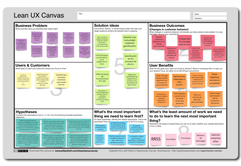
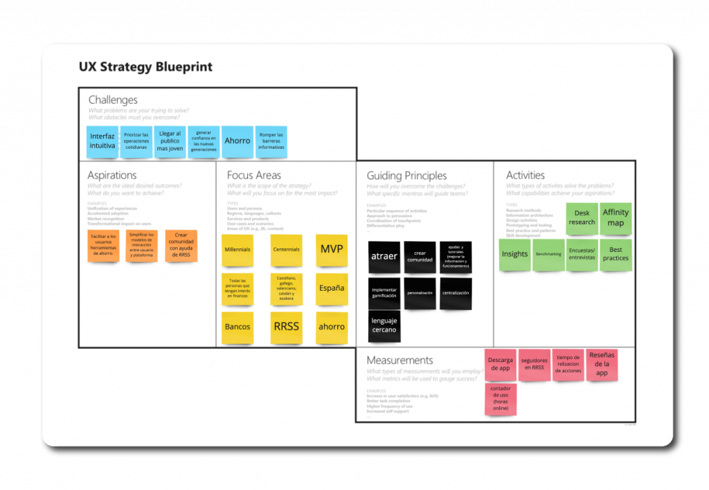
The first thing we considered was which canvas model was best suited to our needs, deciding to make a Lean UX Canvas and a UX Strategy Blueprint Canvas.
Once we were clear about the objectives of our product, we reflected them in our user personas. Five profiles of potential users with real frustrations and goals.
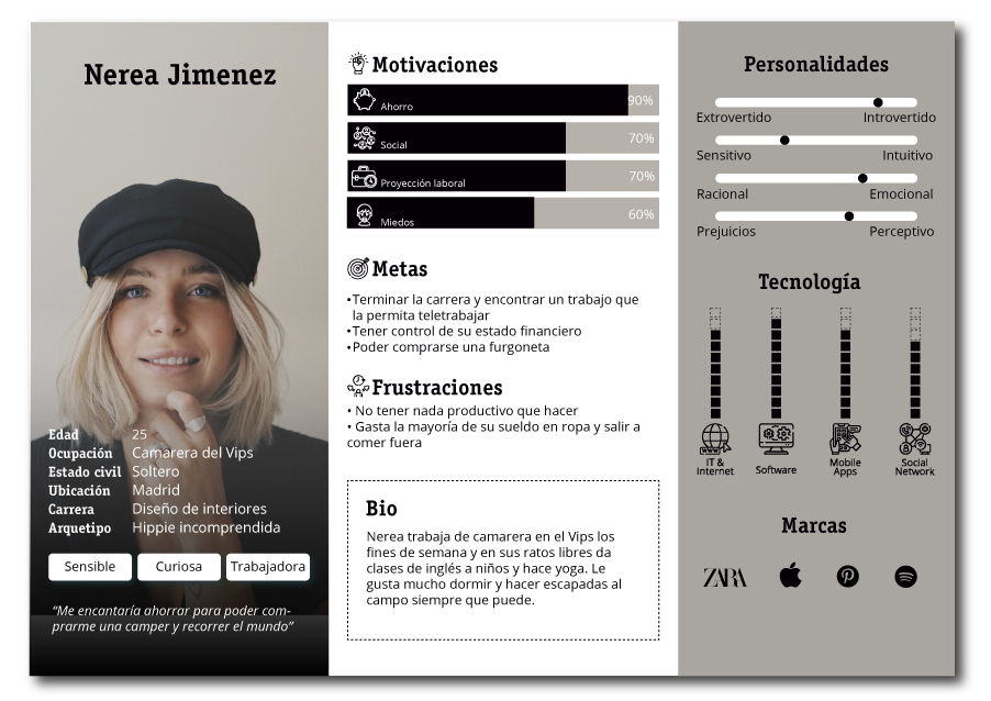
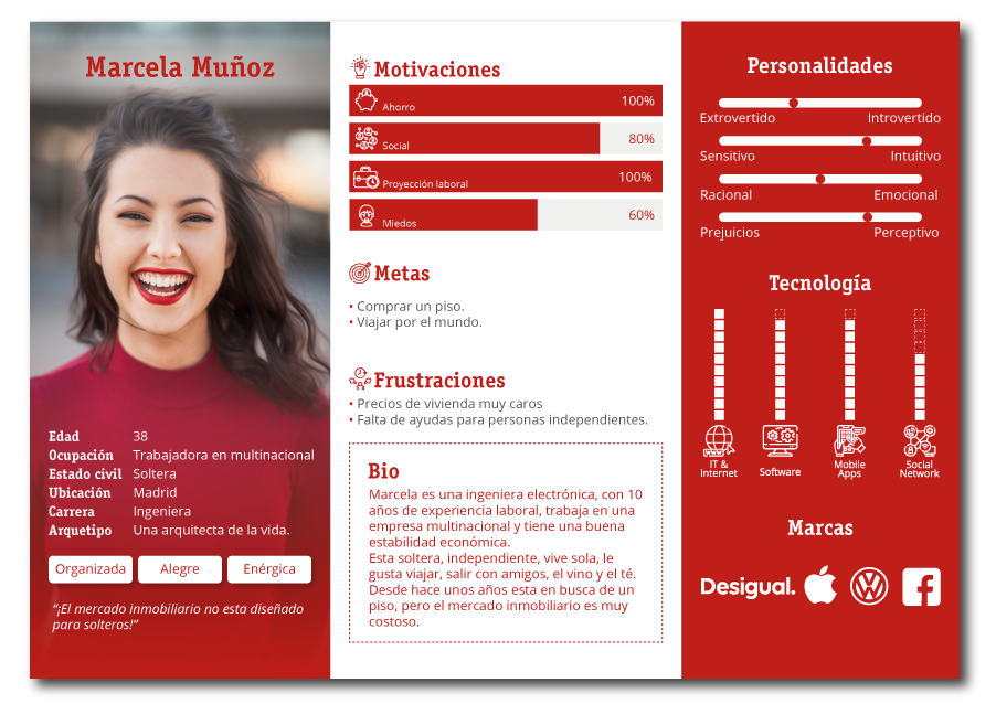

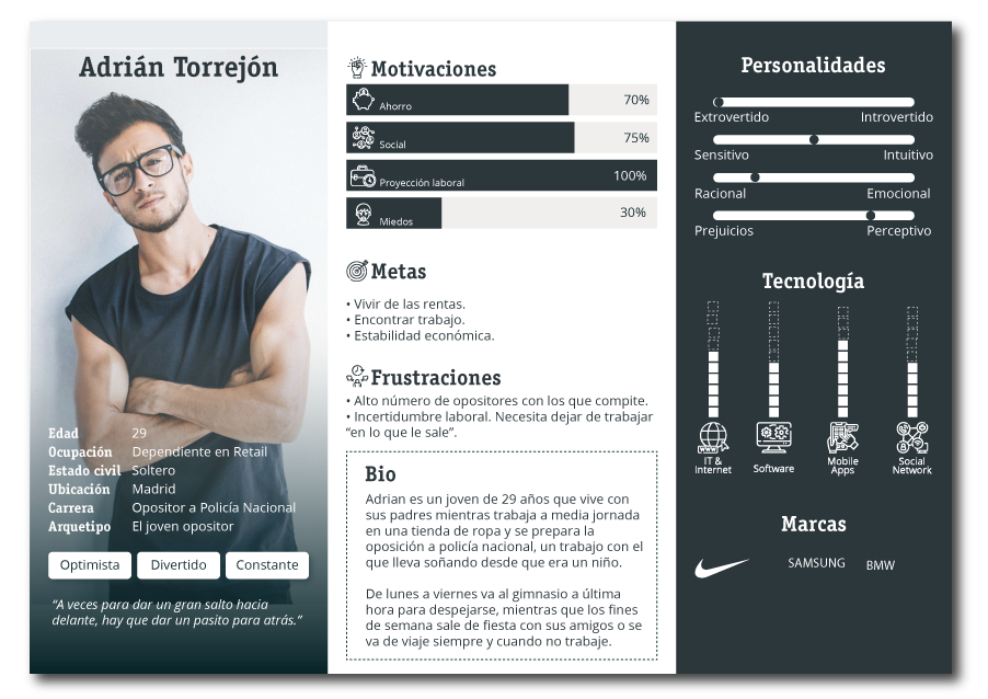
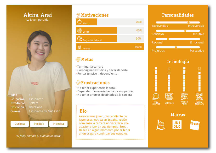
After having our user personas defined, we distributed them in a user map, classifying them according to their level of purchasing power, and their ability to save.
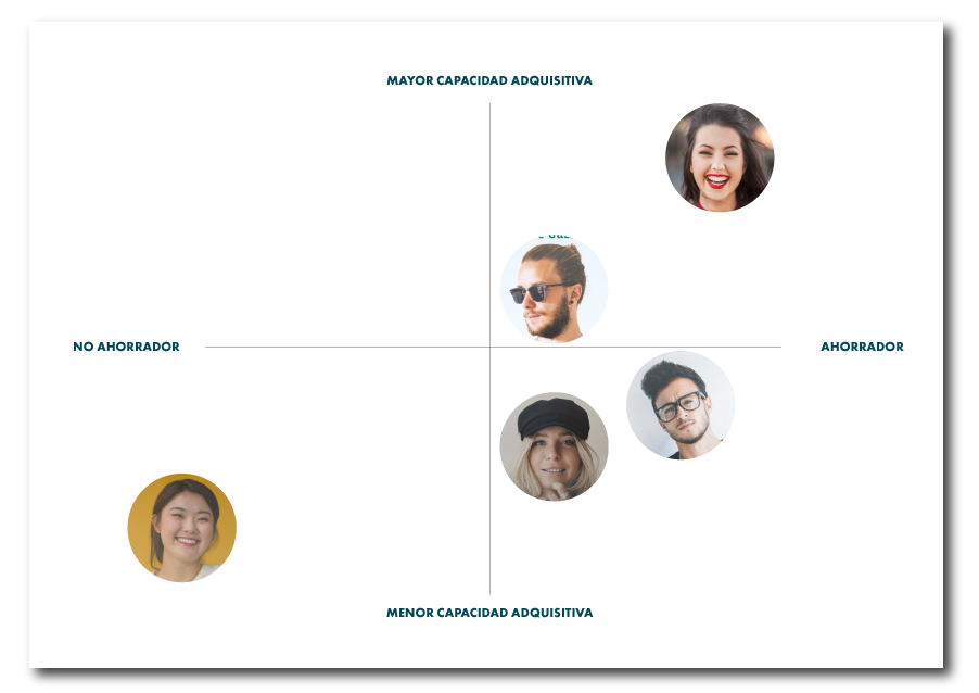
With our archetypes defined, we began to assess the appropriateness of the approach of these profiles, developing a problem statement, inspired by these profiles, asking ourselves “who needs it and why?
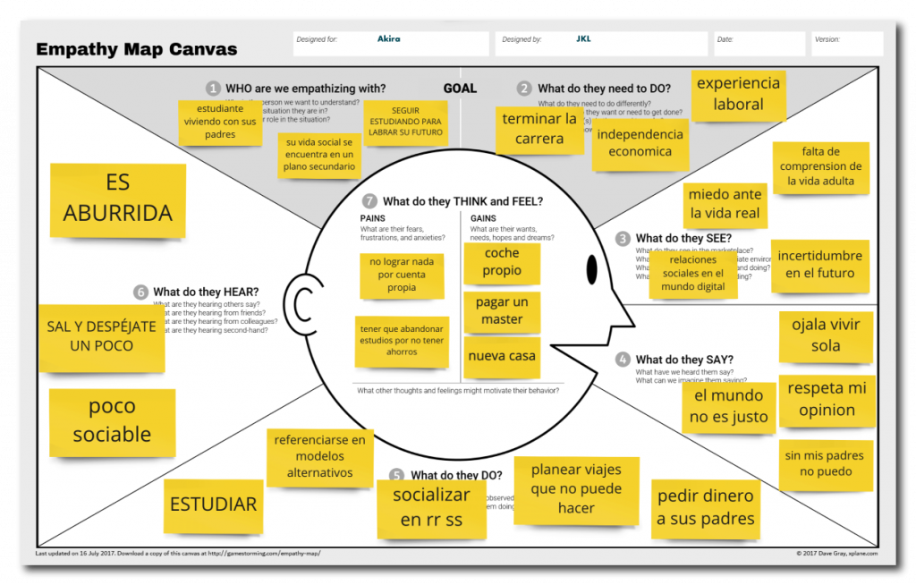
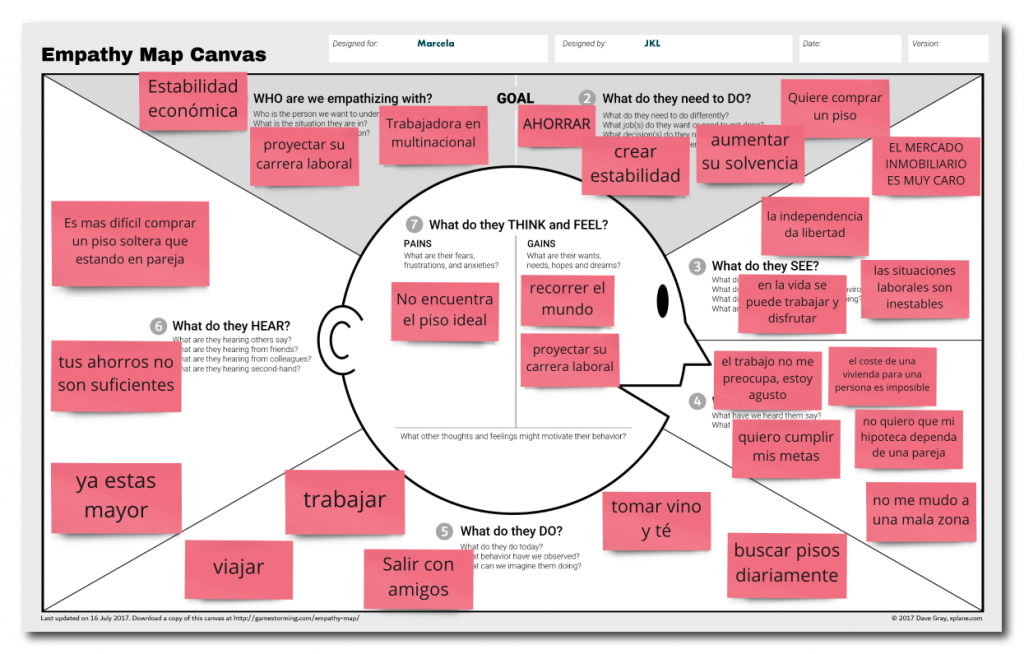
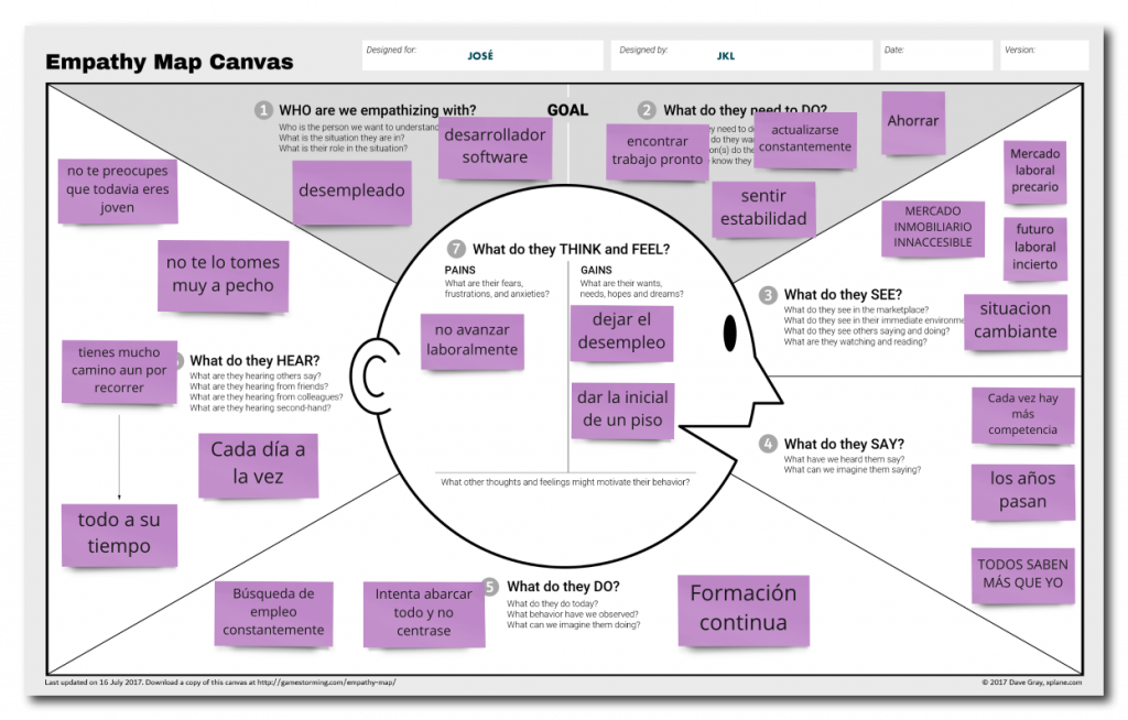
In order to continue with the ideation and conceptualization process, besides knowing our User Persona, we had to empathize with them, with their way of thinking, their needs and their frustrations. That is why we decided to make three empathy map canvas, in which we could reflect the perception of reality that our User Persona would have.
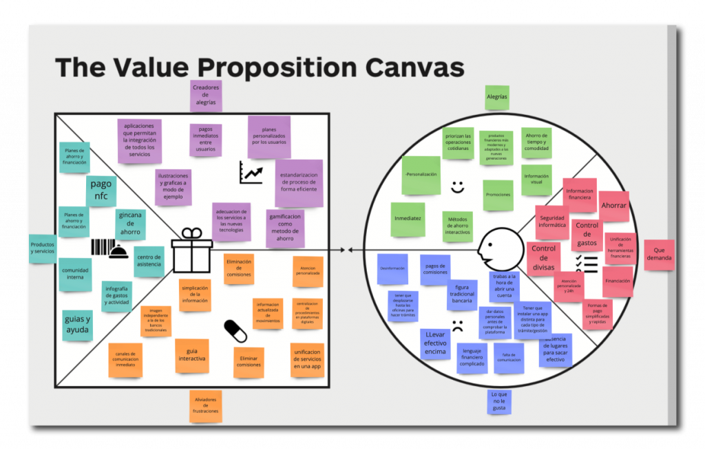
At this point of the process we have already managed to convert much of our research in the real needs of users, we make a Value Proposition Canvas, in order to contrast the needs of our users with our product.
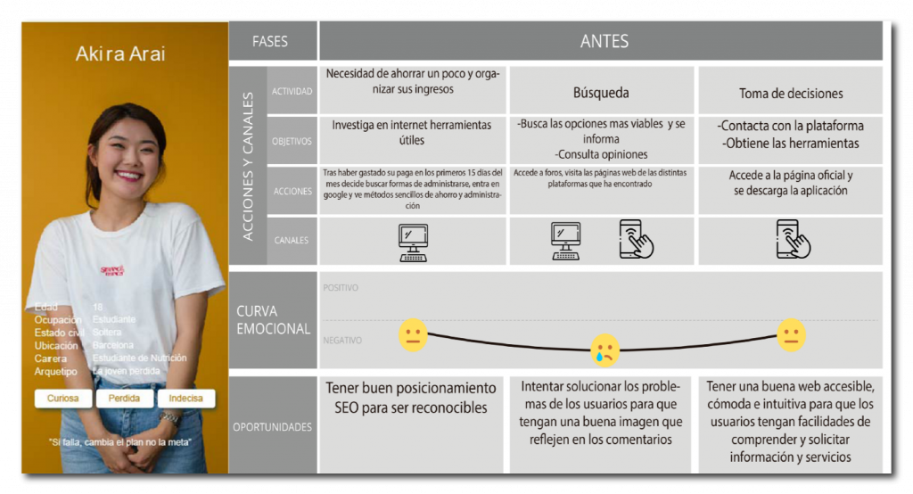
For this process we will use Akira Arai such as heavy user.
A day of Akira…
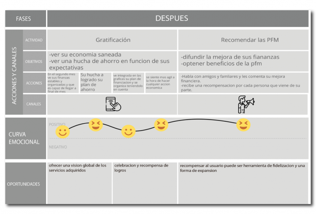
This process consists in elaborating in a fictitious way the development of the activity of one of our users in order to be able to analyze in an empathic way his emotional evolution during the use of our product. To do so, we decided to divide this process into three phases: before use, during use and after use. As a result, we obtained the pain points (those points of conflict with our product). In this way we can resolve these conflicts before prototyping and take them into account during prototyping.
To elaborate this process we selected Akira Arai as our heavy user. The fiction that arises is such as a young student with no income of her own sees her economy in an unstable way and starts using our product to improve her administration and even get some savings.
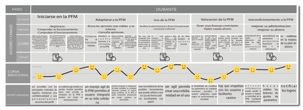
From this process we obtained some conclusions, among which stand out:
- Young people do not like having to invest time in researching and comparing products, so we have to reach them in the most direct way possible.
- Offering the possibility of navigating through our product without having to provide sensitive information offers a greater sense of trust.
- An agile handling of our product will allow the user to integrate its use throughout their daily activities.
- Allowing the user to freely modify the product’s parameters and customize it will be an attractive factor for the user.
- We must offer updated information that reminds users of their possibilities within our product, so that they will get the most out of the experience.
- Encouraging the promotion of our product by users is one of the best means of dissemination and promotion.
Value proposition
In this section we will conclude our ideation and conceptualization process. Reviewing the whole process and analyzing it, we conclude with the following proposals, which will be the point of differentiation, as well as the principles that will guide the following architecture and prototyping processes.
Centralization: our product must be able to bring together both financial information such as the services needed by our target users.
Agility: we must create an architecture that allows our users to access in a simple and direct way to all those tools and products that may be useful or necessary in their daily lives.
Personalization: the possibility of personalizing the activity of each user in our product will allow a more agile activity, such as a better adaptation of our services, reports and attention to them.
To start with this phase of the project, we based ourselves on the main value propositions. The main objectives were to centralize information and activities, streamline the use of our product and personalize the experience of our users.
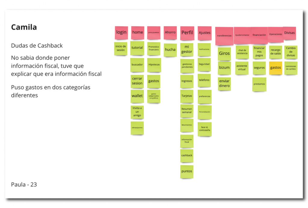
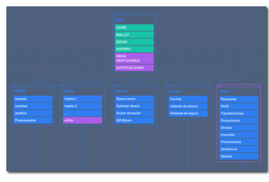
The first thing we considered was the logical order and the main structure of the information in our product. To do this we started by performing a Card Sorting, which would be hybrid. That is, the participants in this process would receive a series of cards with the main tools and services of our product, and in turn we would provide them with the main groups in which they should distribute the cards. We carried out this process with eight participants, whom we accompanied and assisted throughout the process in an ethical manner. In this way we deduced the collective logic for the distribution and future navigation of the information, therefore creating our sitemap, by means of the octopus tool.
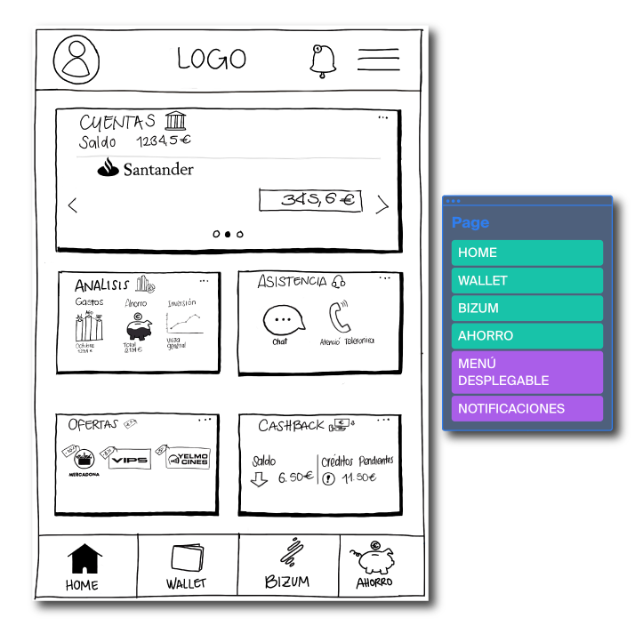
After obtaining a logical order provided by the users we started to elaborate prototype proposals. In this way all the previous work started to become tangible. For this we created a system by means of which the accessibility of the main services and products was located a few taps away from the Home page.
This would be the distribution from which we started, which we reflected in the following Frames to start working on them.
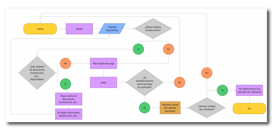
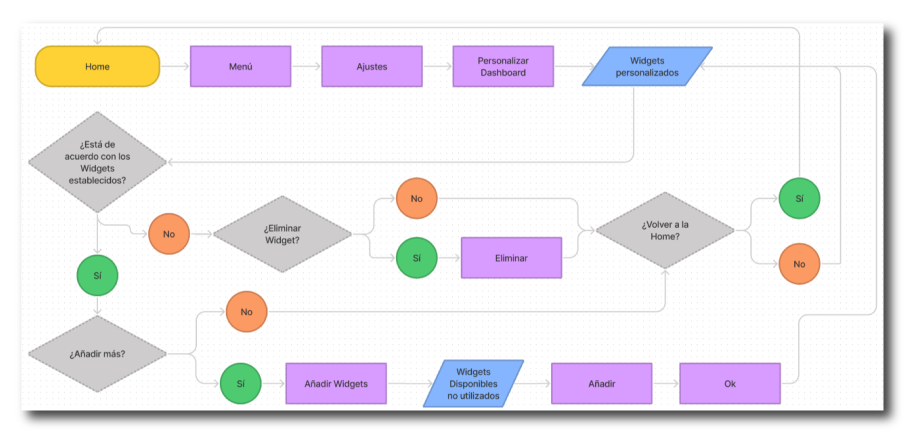
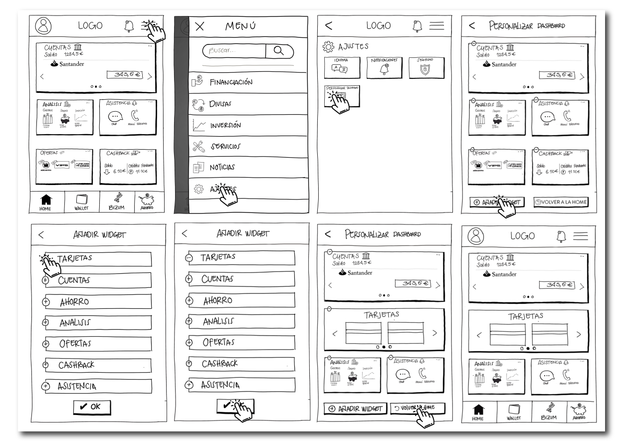
Once we had a developed structure, we proceeded to develop the navigation flows that would govern our product. In this way we verified this coherence and checked the agility we were looking for such as value proposition. For this purpose, we created three flows.
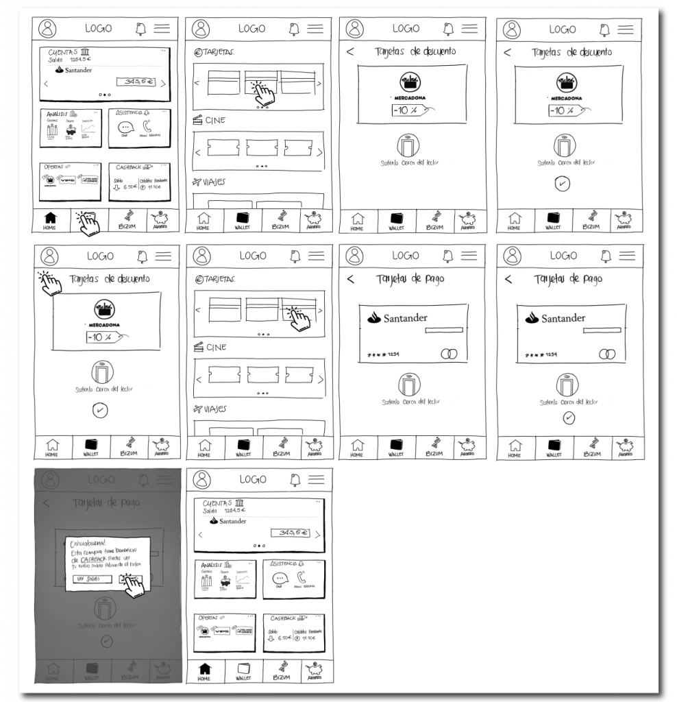
The first flow consisted of making a purchase by accessing the Wallet loyalty cards as well as making use of our product’s cash back system.
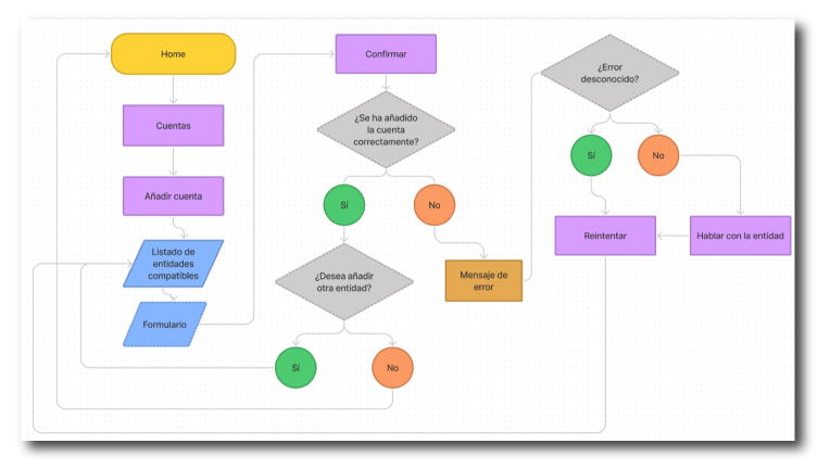
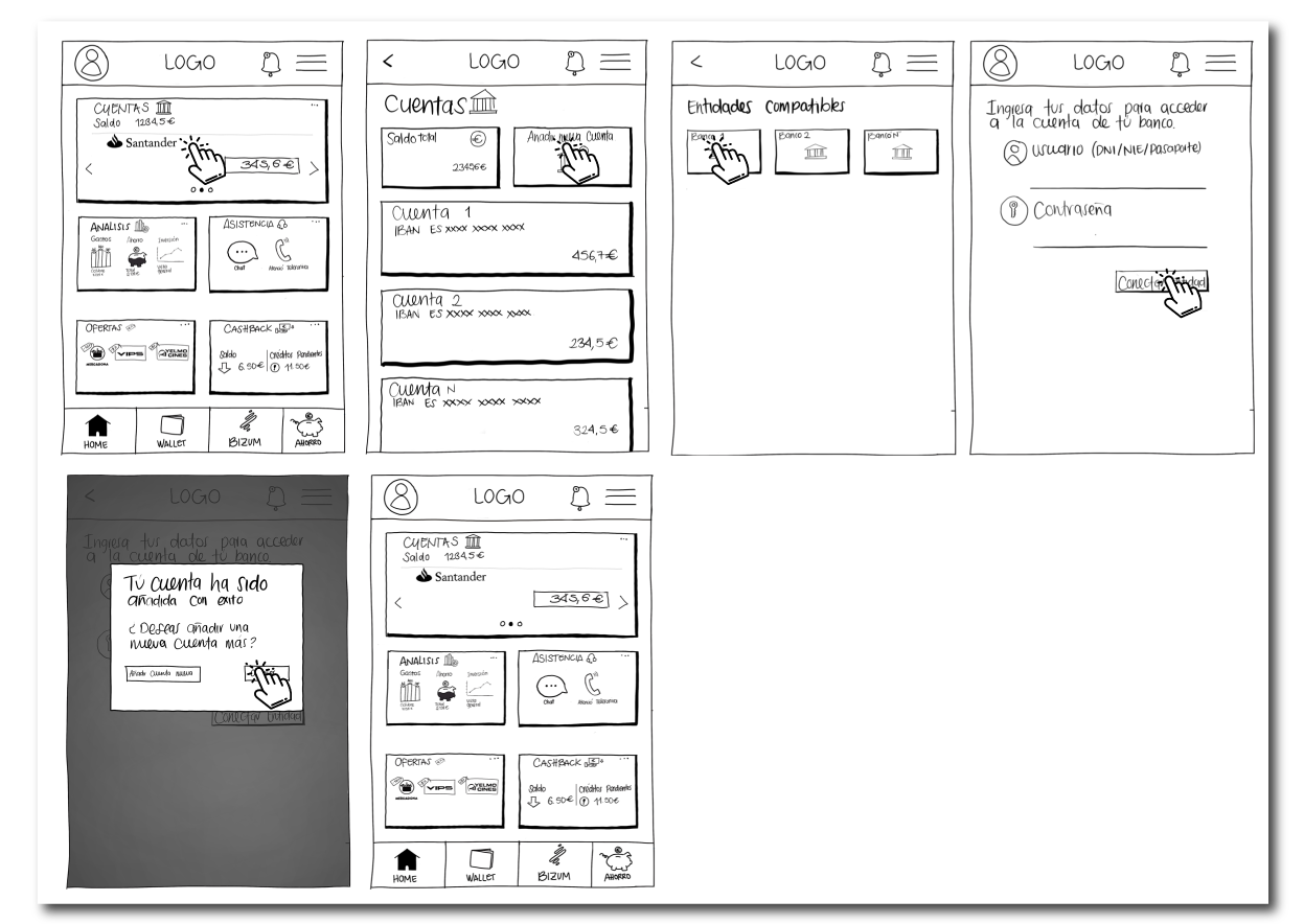
The second flow consisted of linking a second bank account to our profile.
And the third showed the dashboard customization process.
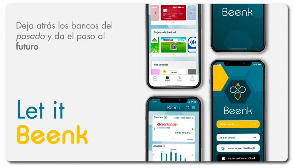
At this point we started to create our brand identity. For this we started with the challenge of coming up with a name, such as the result of a brain storming session we got Beenk. This is the result of the sum of the words bee (bee in English) and bank (bank).
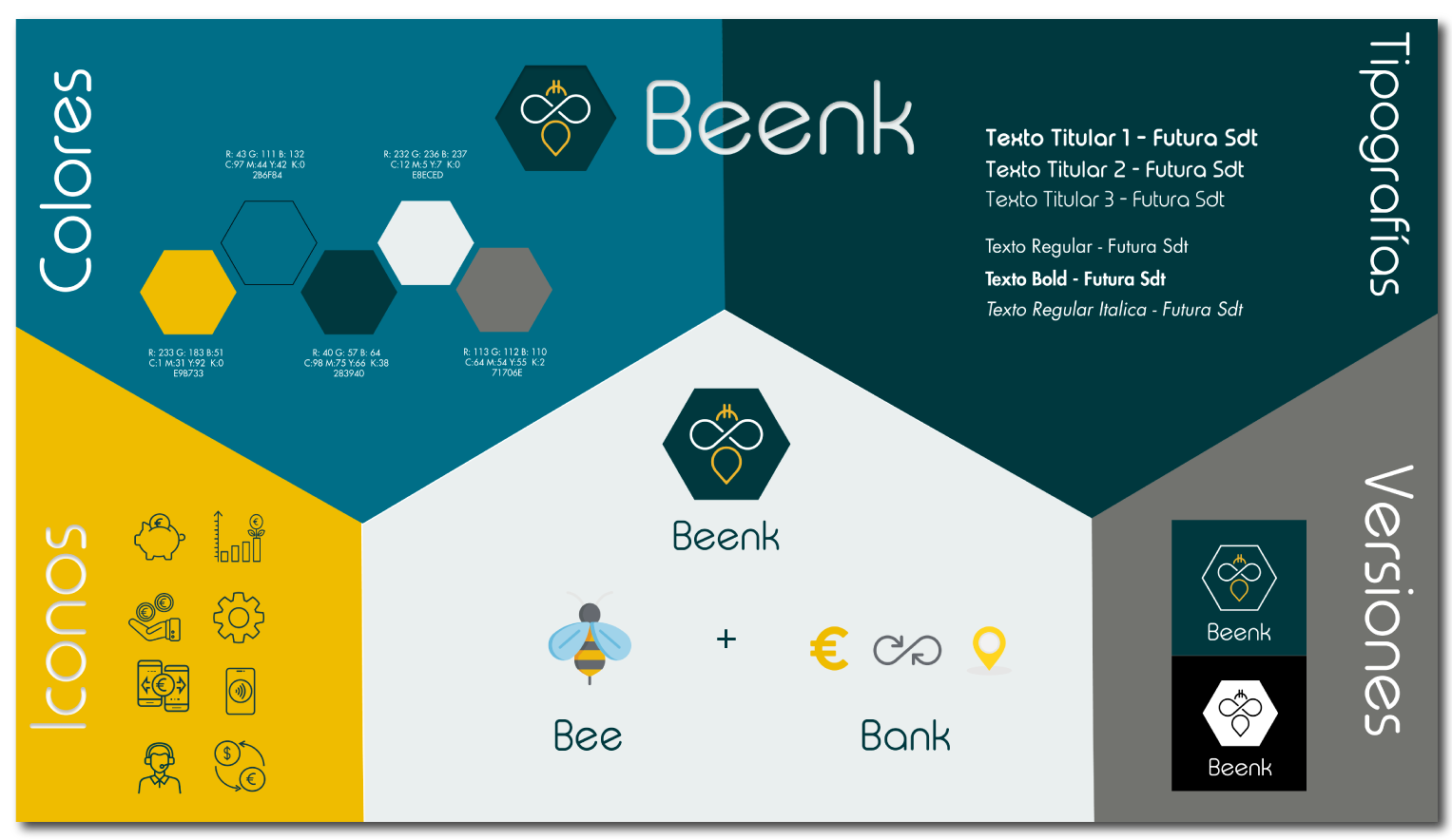
Why a bee? Very simple, bees have been a symbol related to banking and money since the 19th century. In addition, bees are characterized by their collective character, which is related to some of our objectives such as creating a sense of belonging to a group. Such as their ability to collect, which is related to our savings system.
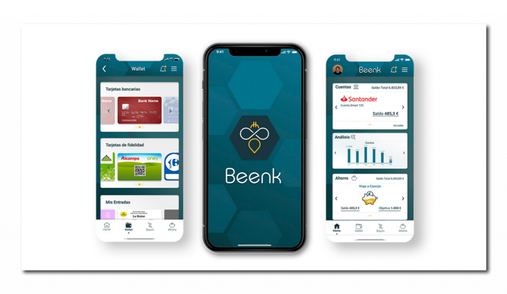
Based on these visual characteristics we started to develop our high fidelity Frames, all of them according to our brand identity.
This was our second approach to the world of UX/UI Design, this case study was done together with Jorge Esteban, Jorge Garcia, Julia Poza y Liz Scaccia during our Upgrade-Hub Bootcamp.
Thank you!
Too Good to go is a mobile application launched in 2015. 4 friends from Copenhagen, during a buffet dinner, realize how much perfectly good food is wasted due to European sanitation regulations. Seeing this, Thomas Bjorn Momsen, Brian Christensen, Stian Olesen, Klaus Bagge Pedersen and Adam Sigbrand create a Shopify, contacting different buffets in the city to prepare a series of surprise packages with the extra food of the day and establishing a pick-up schedule in which the customer could go to pick up in an economical way that extra food, which otherwise would have ended up in the garbage.
Since then, the platform is already history, they have managed to expand throughout Europe, leading the Zero Waste movement, which is among the ecological trends of the moment, such as Fridays for Future or Extinction Rebellion. The company arrives to Spain in 2019, through the purchase of the Barcelona start-up weSAVEeat, and manages to expand throughout the country.
The project is demarcated through a series of very identifiable values, such as sustainability developed through a strong awareness from their blogs on their website. It is established as digital and close promoting the defense of local commerce. Its model is defined as economic, through a green economy, seeking simplicity in its process for the user. For this purpose, they elaborate their mission in a very clear and concise way: “Because #TheFoodIsNotWaste, our mission is to inspire and empower each person to take action against food waste.”

The platform appears with a clear and basic objective; that of solving food waste and surplus from different establishments in exchange for a very economical sum of money that satisfies two basic problems of a customer, his/her hunger while paying as less as possible.
In this context, we understand that we have more platforms that are performing similar actions, in a direct or indirect way:
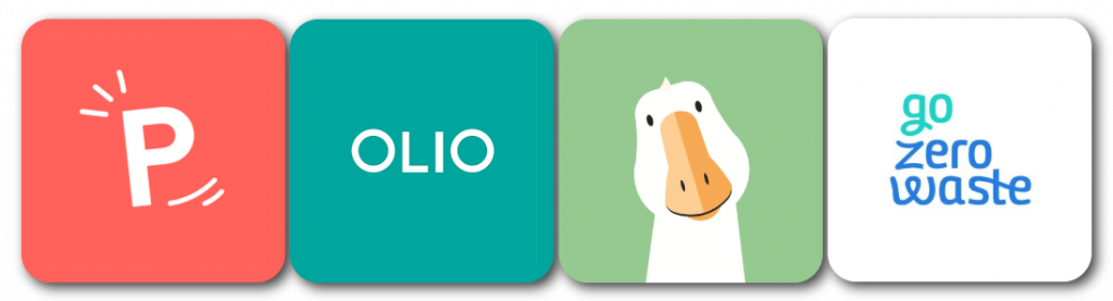
As direct competitions we find these four platforms that dedicate their spaces to solve, more or less, the same needs.
Phenix has practically the same mission, to establish a relationship between the establishment and the user so that the user can buy the extra products of the day in an economical way.
Olio establishes a U2U relationship in which your own neighbor can deliver food to you that he will not eat and will expire soon.
Gander notifies users of discounts produced in establishments that sign up for upcoming expiration or product withdrawal.
Go Zero Waste is a Catalan start-up in which different establishments related to the zero-waste trend (such as bulk stores, second-hand stores…) are showed through a search engine and map, allowing users to locate establishments of this type and improve the reach of local commerce through these practices.

Compared to the previously described platforms, we find an indirect competition to these services. We all mostly know them, due to the fact that they are essentially handling the same thing, Deliveroo, Just Eat, Glovo and Uber Eats among others, these are highlighted in the sector such as food delivery platforms, in which they show different establishments that connect with users through these same platforms. Cocopí and Wetaca stand out from this competition for another specific fact, both are platforms that deliver food, a la carte, but in nutritional packs that the user chooses as a daily or weekly menu, pretending to bring you the food in an easy way to your workplace or home, making you forget about the kitchen in your busy days. These platforms seek sustainability through their packaging and the rations prepared for the diner in an attempt to zero waste.
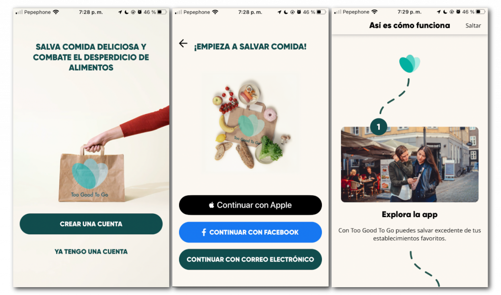
At first glance, the app gives the feeling of fresh design aligned with the principles of the app, maintaining a seamless interface, integrated with the entire phone screen. Its login is neat and keeps the minimum and necessary options to enter the app, highlighting those related to the accounts we use the most; iCloud and Facebook.
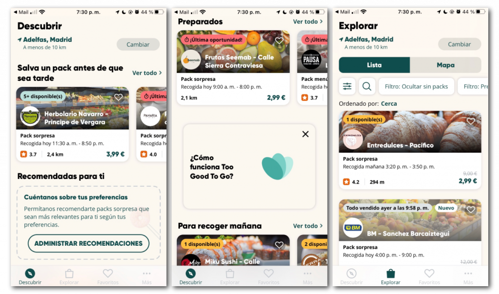
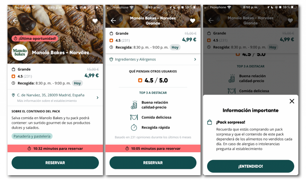
At the moment of ordering, we decided for one of the options marked as favorites previously; tab that works perfectly and arranges the necessary information in a similar way to the explore tab. The structure of the information seems to us correct, letting us see what are the schedules and the price first. Then we find the address of the restaurant since we know that to use this service we will have to go there. Otherwise we do not find many differences when it comes to categorization and information that shows us an application of this style, we would highlight how the banner of the top image is narrowed when scrolling, something that affects the application and makes it look such as a lower category.
When we make the reservation, we see a pop that reminds us about intolerances and allergens because when we do not have the information of what will be the final product is interesting to contact the restaurant in a last step before you make a reservation.
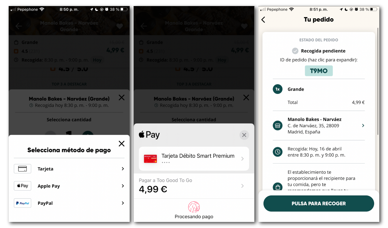
Finally we find the payment gateway, it is a very simple pop window in which we will select the amount and book simply with the payment method of our choice, it is simple and effective, without any complications. After that we will be asked for our personal information and we will confirm the payment so we can go to pick our order up at the agreed time.
The collecting of the product and its personal delivery eliminates the home delivery service, but the packaging is ultimately the same as if it were brought to the home, so the reduction of a plastic consumption is not avoided.
- As an emotional level, the application generated an absolute bewilderment for us due to the great aesthetic disorder that the main page maintains, with the addition that the lower tap-bar becomes difficult to see in low contrasts. The whole process due to the disappointment generated disinclination to use it again.
- As a design level we understood that the graphic aesthetics, late-motives and typographies were very attractive to the user; but they were absolutely opposed to the big problem of the clutter of the main page.
- In terms of functionality, we emphasized that the slowness of the application was noticeable compared to its main competitors, and the disorganized elements produced repetitions of unnecessary information. The simplicity and efficiency of the payment gateway should be highlighted.
To summarize, what were the most notable weaknesses for a possible improvement proposal?
A tap-bar with poor contrast and confusing iconography, which at first glance does not relate the concepts to what the user thinks.
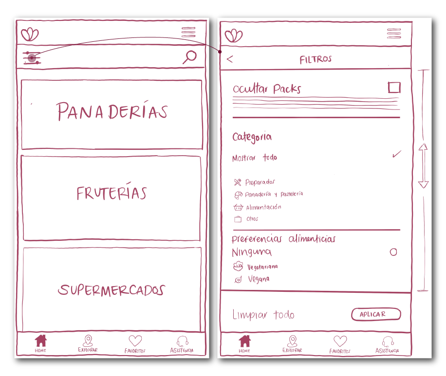
The discover screen, which acts as a Home Page, contains too much disordered information, with down and side scroll, in different elements that repeat this information.
The commercial establishments, through a personal contact with one of them, told us that they had very little supervision on what was happening in the app in relation to the products they were giving out, some of them even abandoning the project.
The exploration radius of the map was very extensive, leaving aside the priority interaction with local commerce; in addition to being disconnected with the tabs that do show in greater detail the establishments.
With those conclusions on the table, we started our design process and drew some wireframes of our improvement proposal.
- Redesign of the Home menu through a greater organizational and aesthetic coherence.
- Reimagining the use of the map and exploration, including the establishments in a more organic way.
- Addition of a more accessible customer service and chatbot to better connect users and the application.
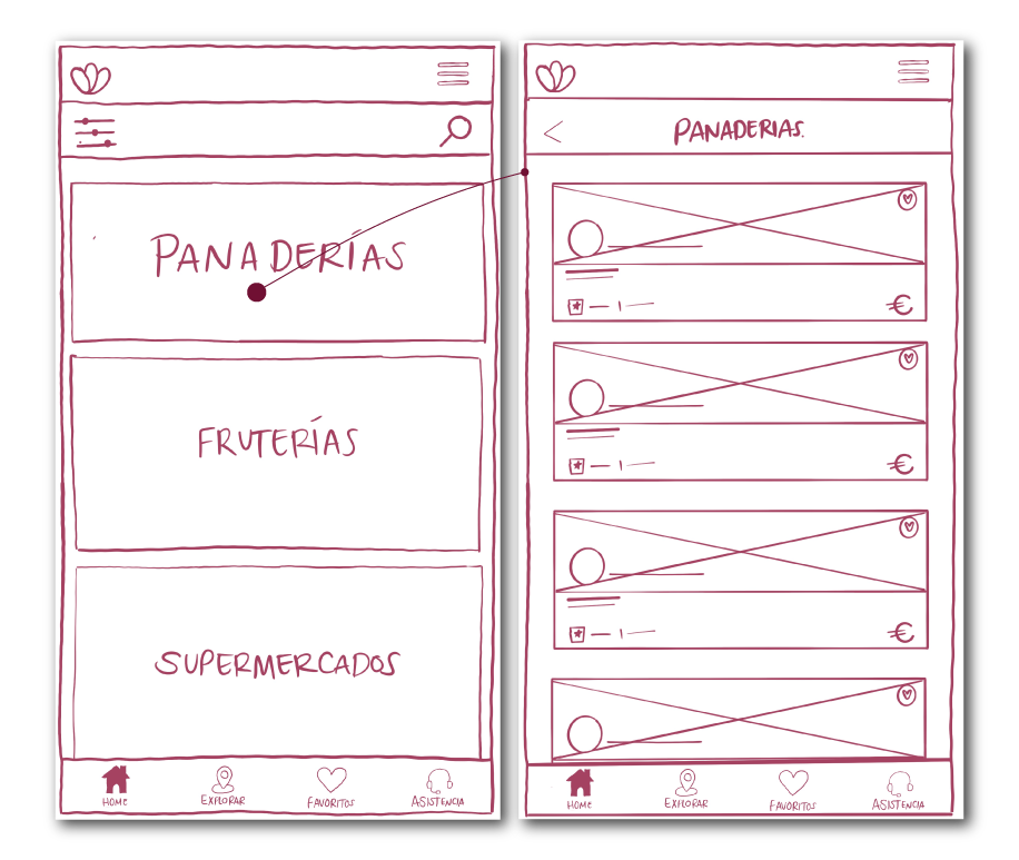
The Home menu is redefined by integrating stores into categories, such as Uber Eats or Deliveroo, allowing for greater organization when searching for specific products.
The search bar is also reunified, integrating the filter menu within it, without having duplicate buttons taking up space. When accessing one of these categories, the app will be sorted in the same way as the current Explore tab, which maintains a better hierarchical and aesthetic order for its use.
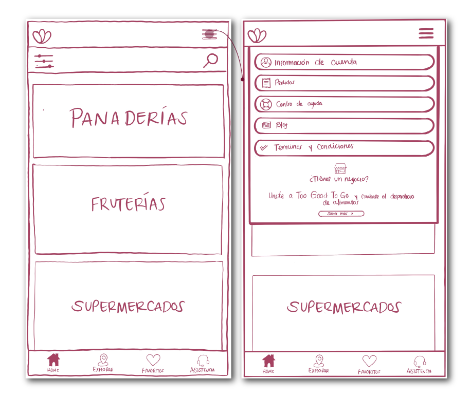
Finally, the bottom tap-bar is redesigned by incorporating a new iconography with more impact on the contrast with the background, and reordering it. Explore will become the new way to access the map and the more button will be removed and moved to a burger menu at the top of the screen. In its place a new assistance button will be brought to the front making this function much more accessible to the user.
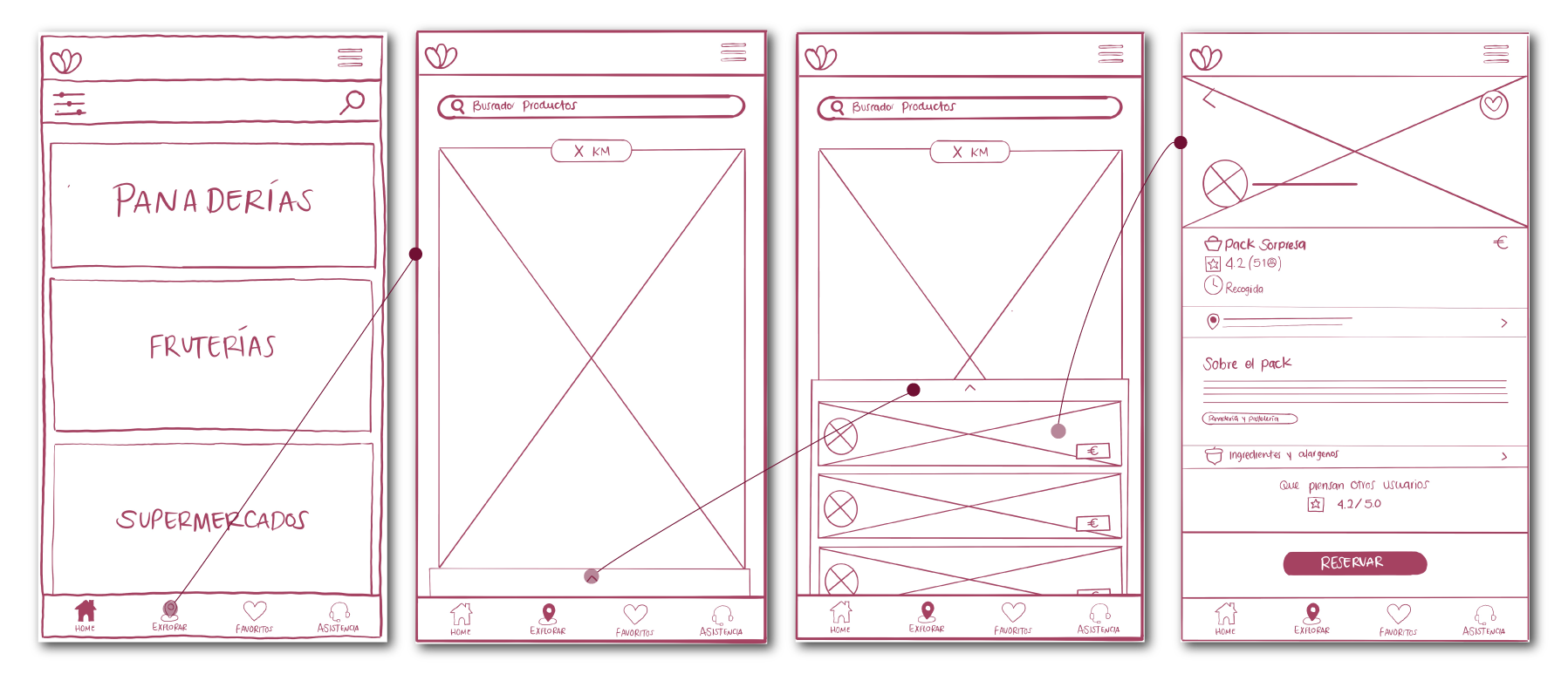
The Explore menu will be redefined to host the navigation function, in a much more accessible way and incorporating a lower slide that visually includes the nearest restaurants and stores in order of proximity.
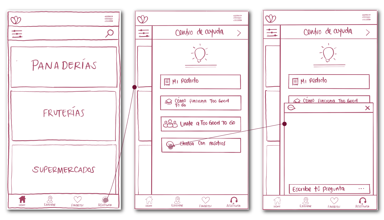
In the lower tap-bar we will incorporate a new button that will bring to the front the customer service, which when pressed will bring us laterally a slide that will incorporate the information and options already existing in the current “menu” to which we will also incorporate an assistance chat booth which will be one of the main means of communication between user and platform to resolve conflicts and doubts.
And of course you can see this working on Figma!
We ventured to define these tasks in a Low fidelity prototype that you can see bellow
This was our first approach to the world of UX/UI Design, this case study was done together with Ismael Casado and Jorge Esteban, during our Upgrade-Hub Bootcamp.